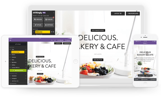


Build your brand. Conquer the world.
Zero code or design skills required.
Making a website has never been easier.


Founder, Tribewanted
"Within an hour, we had probably our best landing page yet and for a fraction of the price. It's amazing. Since then, I've built about 15 sites on Strikingly – it's currently my favorite startup tech tool."


Owner, Red Paper Plane
"We chose Strikingly from the very beginning of our project aiming at simplicity and style. Now as our project is growing, we are very happy to see that our favorite platform is enriching its functionalities and will meet our needs."


Painter & Illustrator
"There is no formula for what 'cool' is. It's a gut reaction. You just know it the moment you see it."
Featured In


Click anything to edit, and publish instantly.
Absolutely no code or design experience needed.
We keep it simple and focused.
Build a beautiful website in under 30 minutes.

Just add our Simple Store and connect to PayPal or Stripe. Start making sales and getting paid, immediately.
Strikingly is perfectly optimized for selling. Add shipping, coupons, membership log-ins, and more. Whether you're selling a single product or a hundred, we make it easy.

Powerful tools to cultivate your audience. Create & manage signups, forms, live chat, and newsletters all in one place. You can even register memberships to keep your audience engaged!
This isn’t just a static page — Strikingly brings your site to life.
Register a new domain name or use one you already own. (Available after upgrading.)
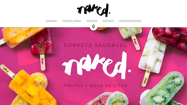
Sell products on your site with full e-commerce functionality! Coupons, shipping, digital goods, and much more are all fully built-in.
Keep your visitors updated with our super easy blogging. Each blog post gets its own page.
All sites come with analytics built-in. See who's been visiting with easy-to-read charts.
Starting a new service or want to get feedback? Just add a sign up form or a contact form!
Show your Facebook, Twitter, and Instagram feed directly on your site.
All wesbites get HTTPS automatically, for free! Enhanced security, SEO boost, and gain visitors' trust.
Galleries, video backgrounds, media sliders, custom colors, password protection. It's all integrated into our slick, modern designs and our intuitive editor.
Message us anytime by email or live chat. Our Happiness Team is always here to help you succeed.
We're fanatical about your success. Hear it from our users – Strikingly just works.
 Seth Godin
I started using this tool and it turns out it's a simple web development tool that is all plug and play... It's hard for me to imagine a website being ten times more beautiful than what you can build with Strikingly.
 Rebecca Bloom
I run a small business from home and I quit GoDaddy long ago because it was expensive and pretty byzantine. I work part-time and I don't want those hours spent on satellite website issues — I want to maximize my earnings. Strikingly is so intuitive and functional. I love it!
I've told tons of my friends about it already.
 Mike Pacifico
I actually just want to say how impressed I've been with the site/software/mobile app. I looked at a few options before going with Strikingly, but I'm so glad I did.
Amazing UI/UX, perfect balance between being simple, yet customizable – and at no point was I "stuck"; everything just seems to work. Great stuff and thanks again!
 Zia Kusuma
I'm one of your big fans! Strikingly is just amazing! I always had problems choosing templates or themes whether it's on Tumblr or Wordpress, with a bunch of options, but only few (like really few) that suits my taste. But Strikingly won my heart!
 David Smooke
When we first starting looking at Strikingly, we were taken back by how beautiful things were. Strikingly makes it so easy to make their templates your own that by the time you're done, the page won't have a "theme," it'll be yours. Ease of use, check. Beautiful, check. Different, check.
We help entrepreneurs & creatives thrive.